Branding: Infinity Renewable Energy
Infinity Renewable Energy is a hypothetical company focused on creating clean, sustainable energy solutions. This class revolved around creating a visual identity from the ground up and building on it as I went. My vision for IRE was fresh, modern, clean, and sleek, and I strove to incorporate that into all elements of the brand, including a logo, a folder, product packaging, and a website.
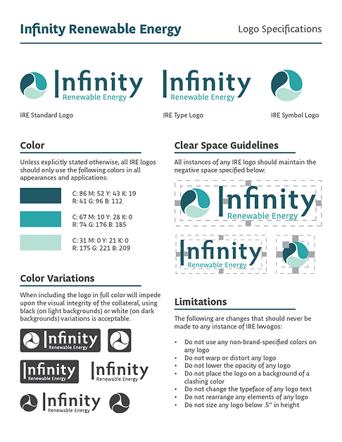
Infinity Renewable Energy Logos & Clear Space Guidelines
The first step for this assignment was creating the logo. It was required to be abstract and not based closely on a relevant motif, like a light bulb or a leaf. I wanted to invoke clean energy, harmony, “infinity,” and progress, so I drew inspiration from the recycling symbol and a wind turbine to create the symbol logo. I wanted my font to be sleek and modern while remaining friendly and accessible with an emphasis on “Infinity.” Completed in Adobe Illustrator.
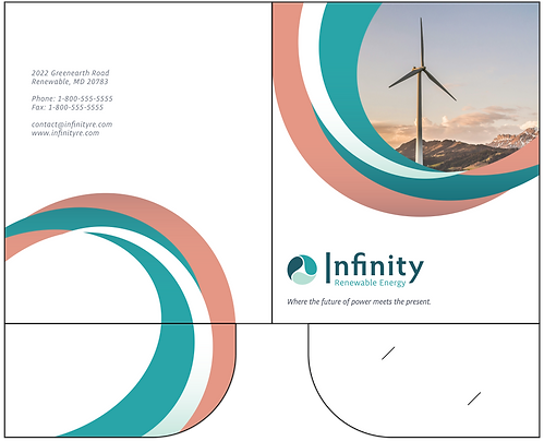
Infinity Renewable Energy Folder Design
The next assignment required a design for an IRE-branded folder for use at a business conference. I incorporated new secondary colors in orange and gray to bring contrast to the existing teal-centric palette. My goal was to say a lot with a little; I implemented the colored curves because they felt lively yet refined while uniting the design with the round motif of the logo. Completed in Adobe Illustrator.


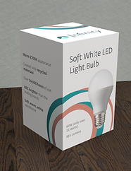
Infinity Renewable Energy Packaging Design
The next assignment was to design packaging for an IRE-branded light bulb. I continued using the colored curves, but I challenged myself to compose them in a way that would create full circles when the box was closed to echo the logo, convey a cycle, and create unity across all sides of the box while maintaining a sleek, minimalist look. Completed in Adobe Illustrator, rendered in Adobe Dimension.

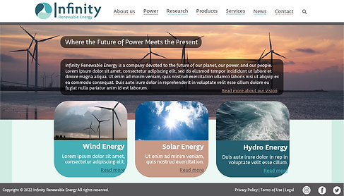
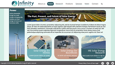
Infinity Renewable Energy Website Wireframes
The next assignment was to design high-fidelity wireframes for an IRE website. This website would hypothetically be available to the public, so I kept it as accessible as possible with simple, clear menus and page layouts. I rounded the corners of rectangular assets to continue the round/circular motif established earlier. Completed in Adobe Illustrator.