Branding: Boston Terrier Rescue of East Tennessee
This assignment required me to research the existing visual identity system of Boston Terrier Rescue of East Tennessee and both incorporate and elaborate upon it. I stayed true to existing brand elements–the logo, the typefaces, the use of cherry red–and developed more on my own, including an expanded color palette and a simple, recognizable illustration style.
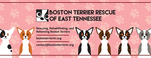
BTRET Facebook Banner
The first task I completed for this assignment was designing a Facebook banner for BTRET. I considered using an image of a Boston Terrier, but I wanted something more memorable, so I developed a simple but distinctive illustration style to utilize across collateral. I leaned on the existing red in the branding guidelines to keep the graphic bold and recognizable. Completed in Adobe Illustrator.
BTRET Facebook Event Graphic
My next task was to design a graphic for a Facebook Event. I strayed from the existing color palette for a Halloween ad because I wanted to set it apart as a special, seasonal event as opposed to daily content. I tied it back to BTRET by using the dog illustrations and their logo. Completed in Adobe Illustrator.

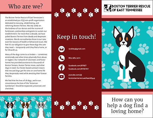

BTRET Tri-Fold Brochure
The final task in this assignment was to create a brand-consistent brochure that employed the folded medium and used the provided text. I took advantage of the tri-fold structure to construct a narrative as the brochure is opened: pique interest with the title, introduce the organization, present ways to support the organization, complete the interior with an inviting and humanizing feature, and conclude the narrative with contact information. I used the dog illustrations to keep the content playful and remind the reader of the impact they can make through support. Layout completed in Adobe Indesign, illustrations completed in Adobe Illustrator.