Branding: PopFlex
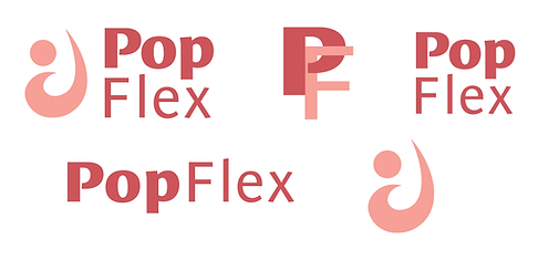
PopFlex Active is a womens activewear clothing brand focused on femininity, body positivity, and fitness. This assignment required me to execute a complete overhaul of PopFlex's visual identity system, including logos, color scheme, and typefaces. I wanted to find a balance between femininity and strength, so I married the two: shades of pink grounded with navy, a delicate yet sturdy symbol logo, refined but uncomplicated typefaces.


PopFlex Development and Logo Redesign
Because PopFlex's CEO got her start as a pilates instructor, I drew inspiration from various stretches and pilates exercises to develop a logo that is strong and bold while maintaining its grace and femininity. I included a style guide to go with it. Sketches completed in Procreate, logos and style guide completed in Adobe Illustrator.

PopFlex Website & Social Media Ad Mockup
After establishing the visual identity system, I implemented it in a mockup of the website. The website closely follows the existing structure of the PopFlex website with all relevant elements updated to follow branding guidelines. Most PopFlex ads utilize photos of models, so my graphic relies solely on branding guidelines. Completed in Adobe Illustrator.

